Professional Lawyer Business Cards
12 Professional Lawyer Business Card Design Ideas
Getting more leads, maintaining existing clients, and building a brand despite stiff competition: these are the trials lawyers face outside courtrooms and legal offices. In this case, attorneys and legal counsels have to find a way to get their services and expertise known to as many people as possible.
As a practitioner, you don't just sit and wait for someone to call you and ask for legal advice. Printing professional business cards is one of the surefire ways to meet potential clients, create good first impressions, network with others in the industry, and have a strong brand for you and your firm.
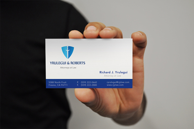
Source: Davier Interactive - behance.net/gallery/Yrulegui-Roberts-Law-Office/378302
Professionally printed cards, aside from expressing your sense of identity, can also help you get into business. It's important to make a creative and appealing business card design for branding and easy recall. For lawyer business card design inspiration, check out these expertly designed samples:
Compare how the information were presented with these different styles and designs, printed on both sides or just on the front. Learn how these examples worked well in marketing legal services and get ideas that best suit your business cards.
Printed Side: Front Only
If you only want to use your card's front side, don't forget to put basic details to keep the lines open for communication. Making it simple and neat helps give your card a professional look and feel. The simplicity and neatness of the design won't make the card look boring as long as you use the right combination of colors and typography.
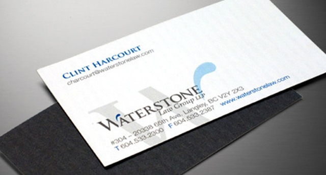
Source: Industrial Brand - behance.net/gallery/Waterstone-Law-Group/581106
Having no graphics can also work; the combination of just typography, shadow, and a few colors gave this card a stylish feel.
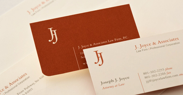
Source: modern8 - behance.net/gallery/J-JOYCE-ASSOCIATES/508807
Either you go for a lighter or darker color as your background, it's important that they match well as these two cards show above. You can even use a die-cut shape for a chic finish.
Printed Side: Front and Back
For double sided business cards, you may want to use the back side for branding, while leaving the important details printed on the front. The back of your cards can also be used as appointment cards, calendars, and coupons.
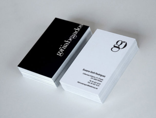
Source: Marina Goñi - behance.net/gallery/Goiabogados/328462
Black and white can be a striking combination.

Source: John McHugh - behance.net/gallery/Whitney-Bogris/169259
Oversized typography gives an emphasis to this card's type face, with the use of a few font colors. Though it extends to the edges of the card and looks like trimmed, the oversized text works well as the card's design.
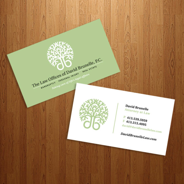
Source: omni6us - omni6us.deviantart.com/art/DBL-Card-162813870?q=boost%3Apopular%20law%20business%20card&qo=41
A refreshing look for your professional lawyer business cards.
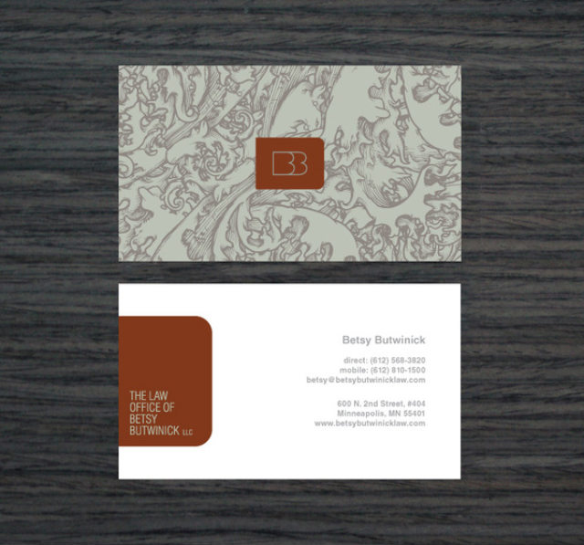
Source: Garrick Willhite - behance.net/gallery/Law-Office-of-Betsy-Butwinick-Brand-Design/653543
It's a good idea to place plain text on the front and your logo at the back of your card, with a visually appealing background like this paisley pattern used by this card.
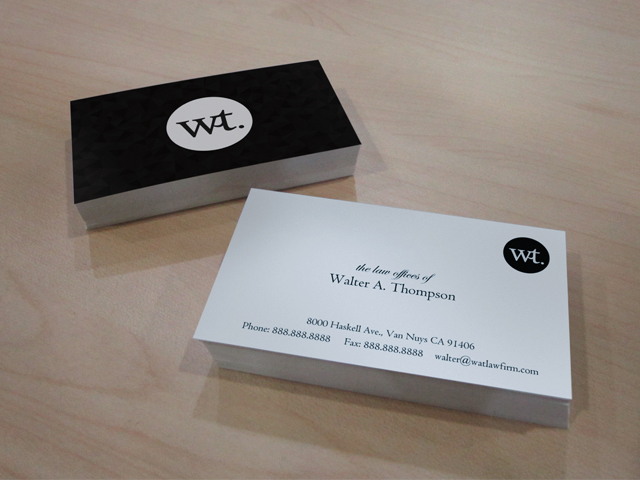
This black and white business card design is created by our very own designer. If you want to use this and get a PSD file, just give us a call at 1-888-888-4211.
Creatively designed lawyer business cards can help new and existing clients remember your brand. Have your cards designed and printed; UPrinting might be of help when it comes to customizing your card's size and shape and proofing your file before printing. Call us or launch Live Chat for details.

